Oh! This entry is more than 2 years old.
I've decided to let some of my old work stay on this site as a reference point to my progress!
Cecce
Self branding
Trying to brand yourself is very challenging, but I think I managed to keep my brand simple and stay true to myself. I wanted something simple so the focus would be on my work and not me. I am not a good speaker or a salesman, I just like to let my work/products speak for itself and then let people make up their own mind.
The Logo
I wanted my own logo, and I wanted it to be simple and reflect me. I chose to use my name: Cecceaya as a starting point. C being the first letter in my name as well as the main letter, it was only natural to use that. And I also started playing with shapes, I wanted a geometric feel and something that can be interpreted in different ways.


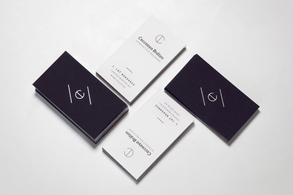
Business cards
The business cards will be a black & white duplex card with silver foil stamping of the logo. The white side will contain the contact information in black print with the small size of my logo. The sides of the card will have a silver edge foiling. I chose a card with a rough finish for the organic look and nice feeling. The cards look and feel very sturdy.
The Resume
I spent a lot of time on my resume. I wanted it to be simple and clean looking, but at the same time have some sorts of design to it. I played around with positioning and sectioning for many days, to get everything exactly right. I am pleased to say that I'm really happy with the final result and I thought I came to a nice middle ground between decorated and simple.

The Design
Like I've mentioned several times, my main focus was to keep my brand simple. The same focus was on the design of my website. I am assuming my future projects will be full of diversity, so I'll let the projects be the ones to represent me.
The Website
The website is responsive, it's really important to me to make myself available on all platforms. At the moment there's not to many project present, but with time my site will flourish.

